IBO (Instytut Badań Oudooru) is a new institution which appreciably supports advertising industry. Created by the biggest media houses and significant personages of the out-of-home advertising market, IBO studies relationships between the receiver and the carrier, the carrier with the space and, by extention, it situates the receiver on a potentially advertising area. Communicative habits, the intensity of traffic and other factors interest not only media houses, but also advertising agencies or the clients themselves.

We were asked to create an identification for the institution. IBO is not an ordinary brand with a range of products or services. It’s rather a tool, a method of work and a scientific approach to the analysis of the out-of-home advertising’s activities. We see it as an institution which has an aim to arrange and order the advertising zone in Poland. Right now, the chaos and lack of systematization make it less and less effective. We would like to emphasize this values by our project.

The sign is based on a circle, which should suggest that we look at the outdoor problems from a larger perspective and analyse them full angle. Points of different sizes, situated on the circle symbolise cities, junctions, places where the carriers are exposed, the carriers themselves and finally - lively receivers. The lines show us the connections and relations between the carriers and receivers, the sizes, distances and all of the measurable data, which is collected as well as analysed by IBO. Forms compiled this way emphasize the IBO’s scientific character and move the advertising world into the „scientific" sphere. Outdoor is only seemingly static. The points actually correspond with each other and the sign itself brings to mind atoms and constellations of stars, which are in constant movement as well as the receivers of the outdoor advertising - in trams, cars or by feet. Eventually, these forms create a great value - the composition of the best research results, connected into an effective network of the outdoor carriers.


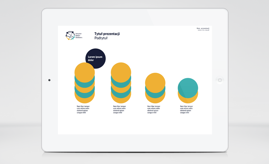
We used navy blue as our basic colour. It clearly shows IBO’s authority and suggests the scientific activity of the institution. Turquoise and strong yellow contrast with each other and underline different levels of outdoor communication. These two colours are a big help in transfering the sign to system solutions, which illustrate and epitomize the results of IBO’s research. We also bring out IBO’s character (a modern institution with a strong base, verified by just research) by usind sans-serif font - Good Pro. This style and colour scheme signal that an advert is not only the intuitive solutions and empirical methods of communication, but also a wide spectrum of information about the market and consumers.